
Signed in as:
filler@godaddy.com
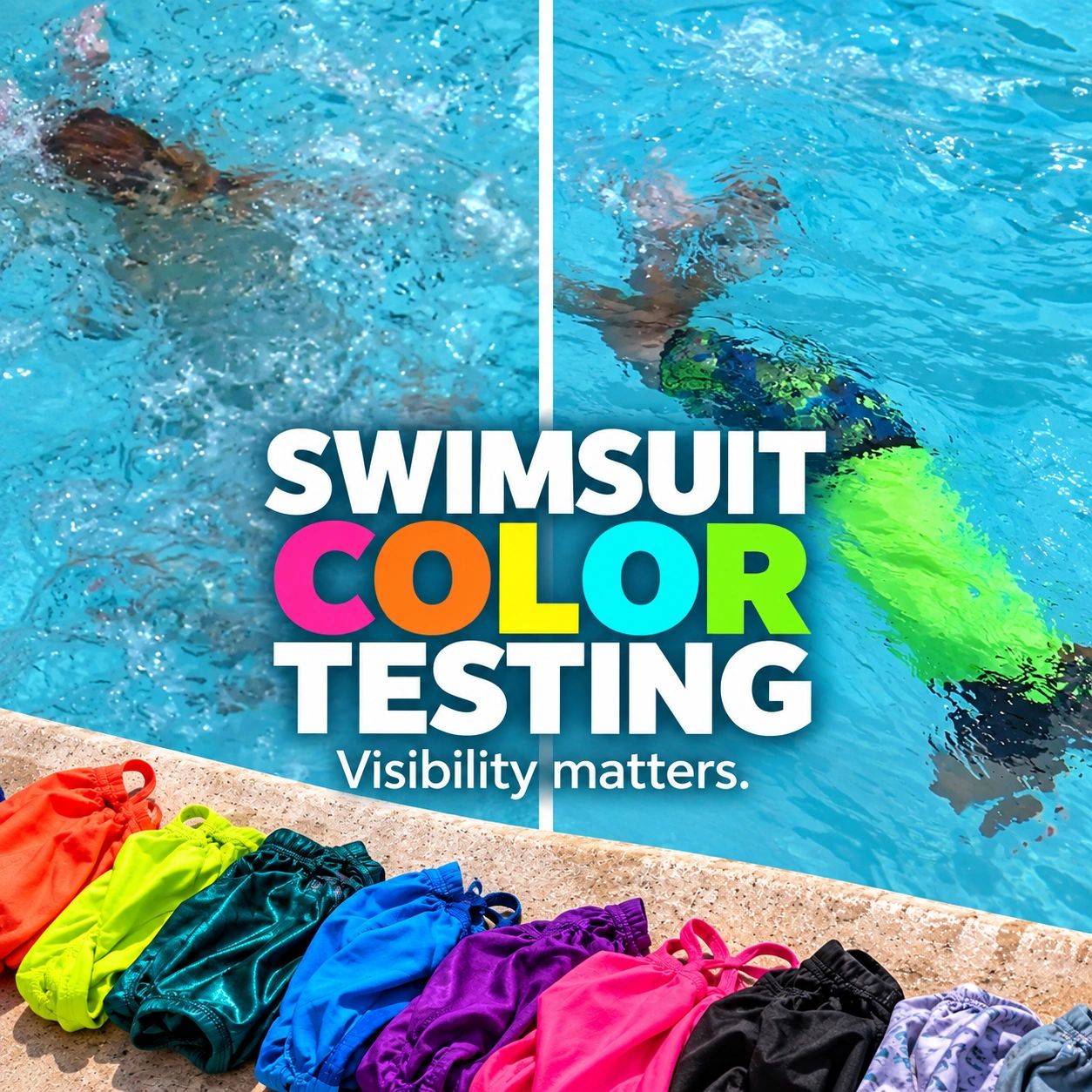
What color swimsuit is easiest to see in the water? The answer depends more on the environment than most people realize.
ALIVE Solutions has conducted a series of real-world swimsuit visibility tests in light-bottom pools, dark-bottom pools, lakes/open water, and patterned swimwear to better understand how color, contrast, water conditions, and surface activity affect what we can actually see. The results consistently show that visibility can change quickly once someone is underwater—and that the colors that perform well in one environment may not perform the same way in another.
Our goal is not to suggest that swimsuit color prevents drowning. Instead, this testing demonstrates one simple way families and aquatic professionals can increase visual contrast and make swimmers easier to locate as part of a broader approach to water safety.
Across our testing, bright neon colors consistently performed better than muted, dark, or environment-matching colors. Contrast between the swimmer and the background matters
Pool bottom color, water clarity, lighting, distance, waves, surface agitation, and open-water conditions can dramatically change visibility. A color that performs well in one setting may perform very differently in another.
Bright swimwear may make someone easier to see, but it does not replace active adult supervision, swimming skills, lifejackets, barriers, or other layers of protection. In open water especially, keeping swimmers at the surface with appropriate flotation remains critical.
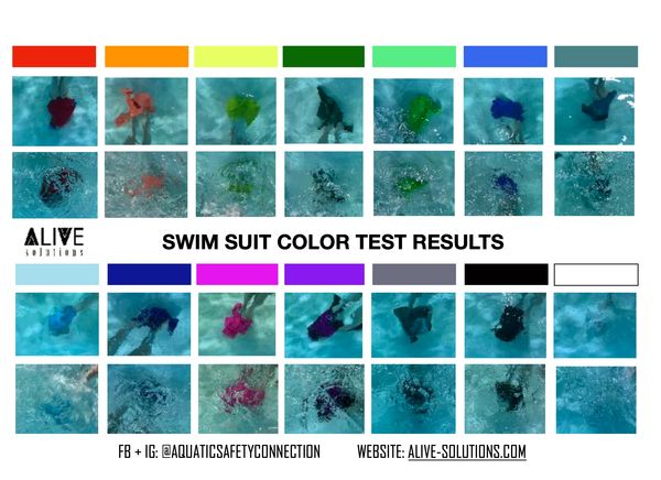
Our original pool testing looked at how different swimsuit colors appeared against a light-colored pool bottom, both underwater and with surface agitation.
What We Found: Neon pink and neon orange were the strongest performers in this environment. White and light blue performed poorly and could nearly disappeared against the light pool background. Darker colors were often visible, but they presented another concern: they could easily be mistaken for a shadow, debris, leaves, or something else on the pool bottom.
Surface movement also made a noticeable difference. Once the water was disturbed, colors became much harder to distinguish—even in relatively clear water.
Lessons Learned: Contrast is more important than simply choosing a "dark" or "bright" color.
For pools with light bottoms:
Bottom line: On a light pool bottom, choose a color that clearly contrasts with both the water and the pool surface.
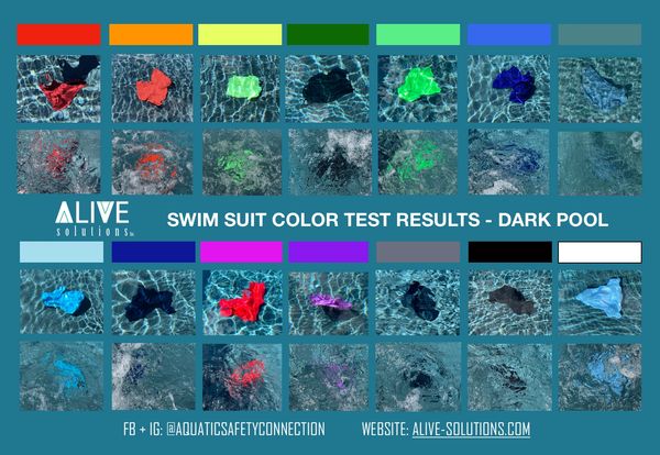
We repeated the swimsuit color testing in a pool with a darker blue bottom to see how the environment changed the results.
It did.
What We Found: The top performers were neon yellow neon green, and neon orange. These colors created the strongest contrast against the darker environment. The blue water also changed how several colors appeared. Red, pink, and orange tones looked darker and more red than expected. White appeared light blue an was fairly easy to see at close range, but disappeared more quickly as distance increased. Dark green, gray, black, teal, and similar colors blended rapidly into the background.
Lessons Learned: The same swimsuit can look very different depending on the pool.
Bottom line: For dark or blue-bottom pools, strong neon contrast is particularly important.
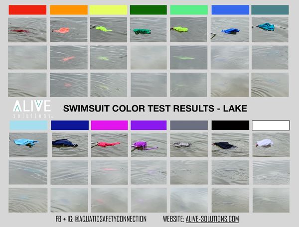
Pool visibility does not necessarily translate to lakes, rivers, beaches, or other open-water environments, so we tested the same concept in a lake.
The test was conducted in approximately 18 inches of water over a brownish-gray lake bottom under partly sunny conditions. Colors were viewed from the surface, from shore level, and from a slightly elevated perspective similar to standing on a dock or boat.
What We Found: The strongest colors were:
Neon yellow
Neon green
Neon orange
White ranked relatively high in visibility but often looked like surface reflection or cloud glare, making it less distinctive. Neon pink—which performed very well in the light-bottom pool—did not perform nearly as well in the lake.
Most other colors disappeared extremely quickly.
One of the most striking findings was that visibility was essentially gone around two feet deep for all colors in that particular environment.
Lessons Learned: Open water creates an entirely different visibility challenge.
Bottom line: In lakes and open water, bright contrasting colors help—but keeping swimmers visible at the surface, including through appropriate lifejacket use, is even more important.
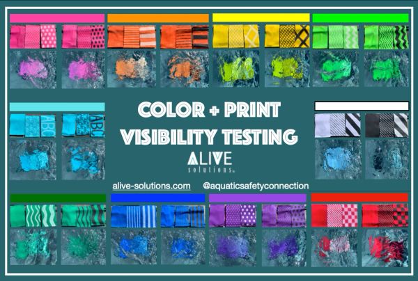
After the original color testing, one of the most common questions we received was:
What about patterns?
So we tested both small and large prints using light and dark pattern combinations against a dark/blue pool environment.
The overall winner didn't change:
Neons still performed best.
Small patterns—whether light or dark—did not appear to have a major impact on overall visibility. Large dark patterns, however, noticeably reduced visibility.
For example, a solid neon orange suit was easier to see than a neon orange suit broken up by large navy areas.
Pattern matters most when it reduces the amount of visible high-contrast color.
Bottom line: If visibility is the priority, choose predominantly bright neon swimwear rather than a bright suit dominated by large dark patterns.
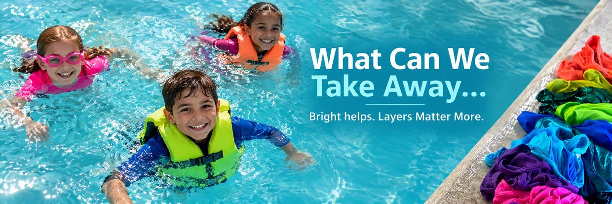
When we placed our light-pool, dark-pool, and lake testing side-by-side, an important lesson became clear:
However, neon orange was one of the most consistently visible colors across the different environments and was identified as a likely overall winner in our comparison.
More importantly, the combined testing reinforced four principles:
Stay bright.
Create contrast.
Keep swimmers at the surface when appropriate.
Keep actively watching.
Even very bright colors can become difficult to see with a relatively small amount of water, distance, turbulence, glare, or surface disturbance.
Choosing highly visible swimwear is a simple way to add another layer of awareness around the water, but color alone cannot keep someone safe.
Use bright, contrasting swimwear alongside:
And remember one of the most important findings from all of this testing:
Visibility is dramatically better at the surface.
The safest color is still only helpful when someone is actively looking.
Want more information on becoming Water Smart? Check out our options for Water Smart courses below...

A super informative course for parents / grandparents / and adults who want to become more water smart. This course is filled with tactical and practical solutions to keep yourself and your kids smarter + safer around the water. Learn more here.
Are you a caregiver (Camp counselor, babysitter, nanny?) This one is for you! This course is a short 1 hour feature highlighting all the important content related to being water smart while you are in a caregiving role! Learn more here.
An amazing course you don't want to miss! This ALIVE Water Smart Kids course is filled with everything kids need to be SMART in and around the water. Learn more here.